-
Hi there,
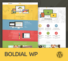
I have a problem with the responsiveness of my whole website (under Boldial) on mobile device: the columns are supposed to stack in one vertical column but they don’t, they just skrink on the same row.
As a result the text cannot be read and the images are very very small…
There is a problem with the navigation bar on mobile device as well: the navigation bar sticks to half the mobile phone screen or more !
When I created the website everything was fine, I don’t understand what changed since then.
Is it a problem with the pixel width in “Responsive layout” or in “Header navigation responsive layout”? I tried to change them with no better result.
Thanks in advance !
Marie
http://www.macassar.frSorry, this forum is for verified users only. Please Login / Register to continue
or get 6 months support forum access to all forum topics for a reduced price.
-
Support time:
Usually 4-8 hrs / might get up to 48 hrsSupport Us
If you are satisfied with our themes & support you can motivate us even more by supporting us (via Paypal).
Themes Support
- General 42
- Qusq Lite 9
- Qusq Pro 110
- Qusq HTML 12
- Ofis WP 0
- Hedy WP 27
- Wildster WP 41
- Tayp WP 44
- TinyShop WP 27
- Freelo WP 80
- Inverto WP 86
- Kreo WP 102
- Kopy WP 207
- Multicorp WP 194
- NO8 WP 266
- Leepho WP 46
- Boldial WP 1,119
- Minicorp WP 470
- Nalleto WP 152
- Zimney WP 10
- Creolio WP 76
Our Themes


